I had a play with the wireframe theme a while a go. It was a disaster.
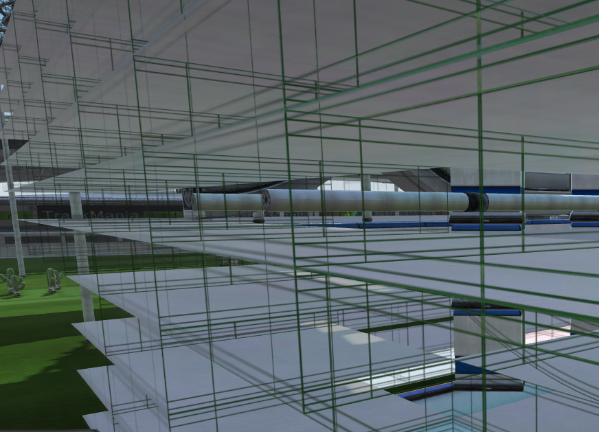
If the wireframe is too widely spaced theres no way of spotting walls and you just go around banging into things, like this:

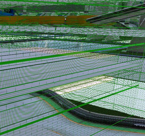
Whereas, if the mesh is to small it all become an unholy mess. Like this:

Which is even worse to drive in. You could add a shade to the model 'face' to help differentiate but that removes the point of a wireframe. ie it's transparent. Also semi-transparency didn't work either as it just looked like coloured glass with lines on it.
Having said all that negative stuff, playing with different levels of transparency on mipmaps might give a better result. I'll let someone else try that one though.
pop
