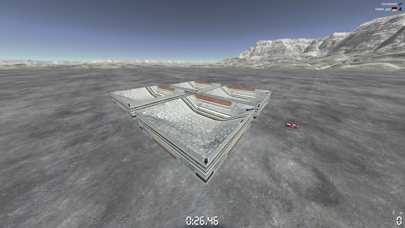
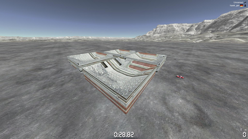
If that's supposedly the start-screen I think it's ugly.
The colours are done right, but the borders doesn't fit, you should really want a more uniform border texture, than having a different one for every frame.
The box in the bottom right looks like some advertisement, and what the hell is ADIL? If it's supposed to be a shortcut to regular Stadium 2, it's somewhat good, although it makes the screen unbalanced imo. Maybe you should dedicate a panel on the right side instead of a small box?
I think the idea of having a Object Hall of Fame in the start-screen might too much. It should be on its own page, because it makes it cluttered imo. Maybe make another link on the bottom (between 'Exit' and 'More' called 'Credits')
Preferably you'd put the Solo and the Editor buttons on a panel on the left side, to keep the common design of Nadeo (I think this is the most important, because those will be the most used buttons on this screen, it'll feel awkward if they're placed somewhere else)
Or is that left panel supposed to be used for servers?, still it should be put on the left side.
Really like the background and the icon in the center. Remind me of how the planet is spinning in TMN/UF a little. The Exit button is placed exactly where it should be, and the font works very good.
Sorry hawk I know I might be overly criticising your work at times, because I see you've put some good effort into this, I just want to make sure you don't put too much work into the wrong things

I think it'll turn out great, and you're doing great work (y)
edit: I'll probably post a pretty paint-picture of this when I get home laters, to give a better picture of what I meant.
I'm too cool to have a signature...